Top 5 Pattern Designs in Film

I recently watched the film Emma (2020) and immediately required fanning and a snifter of smelling salts for the immense visual explosion of luscious pop-tart candy-coloured Georgian draperies, costumes and patterned wallpapers. Delectable macaron maximalism. Emma probably needs a post all of her own but I was inspired to compile a short list of other films containing pattern designs that I love.

Incidentally, it is my absolute dream to have a pattern of mine used on a film set; whether it be costume, wallpaper, soft furnishings or a patterned bag carrying a murder weapon in an Agatha Christie TV dramatisation, I don’t mind. Any appearance would send me sky-high with joy.

So, feast your eyes on these five excellent films and their pattern designs. You might easily guess the ubiquitous pattern in the number one spot, it may have been forever imprinted on your retinas. Let me know your favourite pattern designs used in films and I’ll watch them – all in the name of research.

5 Taxi Driver (1976)

DIRECTOR: Martin Scorsese
COSTUME DESIGN: Ruth Morley

The ‘would you like to come have some coffee and pie with me?’ dress. In Taxi Driver, Betsy (Cybil Shepherd), appears mostly in white ‘like an angel’ but here she is in a dazzling abstract red swirl patterned dress, complimented by Travis’ deep burgundy velvet/velour jacket. The Biba-esque Art Nouveau pattern is strikingly red, which just so happens to be Scorsese’s signature film colour.

The classic wrap dress is by Belgian fashion designer Diane von Fürstenberg. The dress was launched in 1974 after Diane von Fürstenberg saw her own line separates being worn together on television, inspiring her to combine the top and skirt into a single garment, and thus the iconic DVF dress was born.


4 In the Mood for Love (2000)

DIRECTOR: Wong Kar-wai
ART DIRECTOR & COSTUME DESIGN: William Chang

I’ve chosen this exquisite love story not for one particular pattern design but for all twenty-one of the beautiful qipaos, or cheongsams worn by Maggie Cheung.

The film cleverly uses the cheongsams to convey moods, themes, and the passing of time; just as the meals denote the changing seasons. They are all gorgeous but if pressured to pick a favourite, it would be the vertically striped pattern in dark inky tones of blues, reds and gold. This one is worn early in the story and appears on a few occasions. It’s no wonder that this visually stunning film has remained a huge design inspiration for over two decades.


3 I’m Thinking of Ending Things (2020)

DIRECTOR: Charlie Kaufman
PRODUCTION DESIGN: Molly Hughes

A starring role for this well-loved wallpaper pattern; Compton wallpaper was produced by Morris & Co. and designed by John Henry Dearle in 1895 for Laurence Hodson’s Compton Hall in Wolverhampton. Originally, the design required two sets of wood blocks to print all twenty-eight colours owing to the large vertical repeating pattern but it has since been scaled down.

The film has the pattern filling a room in a remote snowy farmhouse in the indigo blue/russet colourway, beautifully setting off Lucy’s (Jessie Buckley) auburn hair. It’s an intricately layered and intertwining design, mirroring the film’s richly complex twists, turns and loops. Like the film, it’s a pattern to lose yourself in.

2 Saint Maud (2019)

DIRECTOR: Rose Glass
PRODUCTION DESIGN: Paulina Rzeszowska

The chillingly brilliant Saint Maud is where I instantly fell in love with the tones and shapes of this large-scale Art Deco wallpaper. The design is Conway by Zoffany Wallpapers and is absolutely stunning in Amanda’s (Jennifer Ehle) alluring and shadowy bedroom.

Possibly a bespoke colourway of the Conway design was produced for the film or colours adjusted with lighting. The four colourways available to buy include a green version named Poison, no doubt inspired by Scheele’s Green. My favourite is the bluey/brown combination used in the film. I’d love to have the whole bedroom – without ‘saviour’ Maud around though.

The wallpaper also appeared in Interior Design Masters - Series 2 where Siobhan Murphy used the design to great effect in a hair salon scheme.

1 The Shining (1980)

DIRECTOR: Stanley Kubrick
PRODUCTION DESIGN: Roy Walker

Surely the most iconic pattern in film history; a design with the unique ability to raise neck hairs and quicken pulses. Carpet pattern perfection for symmetry and the one-point perspective shots loved by Kubrick. The bold 60s-style hexagon ‘maze’ with its red warning lights is perhaps a foreshadowing of the hotel’s exterior maze.

The pattern is Hicks’ Hexagon and was designed by influential interior designer David Hicks (1929-1998). The excellent Film & Furniture.com offers up compelling theories on why Kubrick may have chosen this graphic pattern.

Finally, let’s not forget the Overlook Hotel’s other pattern; the carpet in Room 237… Some might say it’s the stuff of nightmares.


Coasters: Have a drink on us!

Coasters were a hit in the fortyvenus Christmas sales – gifted away to fight the dastardly drip crimes of the season’s mulled wine, Port and Eggnog. Some were used literally as ‘table gifts’, others appeared as Secret Santa presents.

These hard-working wooden glossy-topped squares aren’t just for Christmas though; they are out to save precious furniture, new and old, from evil ring marks all year round. They are on it! Or rather, under it⚡️They’ve got your table 👊🏻 

There are 11 different designs. Each coaster photo has been accompanied by a particular beverage including beer, sherry and whisky. Maybe, if you’re a Poirot or a Marple, you can work out how some of the drinks are linked…

Hemlock coaster2.jpg
Monkshood coaster2.jpg
Lyrebird coaster2.jpg

Magical blooming bluebells

Spring brings us the bluebell season. The intense hue of a bluebell wood, with its dappled light from the tree canopy, is a truly magical sight!

BLUEBELL is the first pattern design in my new collection inspired by iconic UK steam train journeys. Bluebell refers to the Bluebell Railway in Sussex, one of the first preserved heritage lines in the country.⁣ The journey includes Horsted Keynes station – you may know it as 'Downton' from Downton Abbey – restored to the mid-1920s Southern Railway period.⁣ Look closely at the pattern and you can spot rivets, tracks, points and a leaf steam dome.

BLUEBELL ©fortyvenus

BLUEBELL ©fortyvenus

The British bluebell (Hyacinthoides non-scripta), not to be confused with non-native varieties which are sadly threatening the future of our true native variety, has a delicate drooping row of sweetly-scented bell-shaped flowers. Legend says that a field of bluebells is intricately woven with fairy enchantments. We have until the end of May before the bluebells disappear for another year, you can click here to find your nearest bluebell wood in the UK. The Woodland Trust site also has more information about this blue beauty; one of the nation's best-loved wild flowers.

BLUEBELL is now available as a cotton tote design with taupe handles in the shop, perfect for plant lovers and steam train enthusiasts alike.

Bluebell_blog3.jpg

Scottish Luckenbooth pattern for Valentine's Day

The Luckenbooth brooch is a Scottish symbol of love dating back to the 17th century. Often given as a love token or betrothal gift, the silver brooch typically shows two intertwined hearts symbolising love, topped with a crown to denote loyalty. The name is believed to have derived from the shops or ‘locked booths’ that sold jewellery along Edinburgh’s Royal Mile. In the past a Luckenbooth brooch would also have been pinned to a baby’s shawl to protect it from harm and to prevent witches from stealing the milk of a nursing mother.

fortyvenus_Luckenbooth.jpg

My interpretation of the Luckenbooth brooch replaces the usual jewelled crown with antlers; the majestic 'crown' of the Royal Stag with its twelve points or tines. In the centre sits Scotland’s national emblem, the thistle. The repeating motif is reminiscent of dancers performing the traditional Highland Fling; arms held high with fingers forming the antler's points and dancing on a background of heather-coloured tartan.

It was during an episode of Hannibal when I decided to incorporate antlers. As any fan will know, antlers feature prominently throughout the series in all manner of gruesome ways, as do hearts; usually served up from Hannibal Lector's kitchen with actor Mads Mikkelsen, as Hannibal, wearing those exquisite plaid suits. Strangely, it seems Hannibal may well have influenced the whole design. 
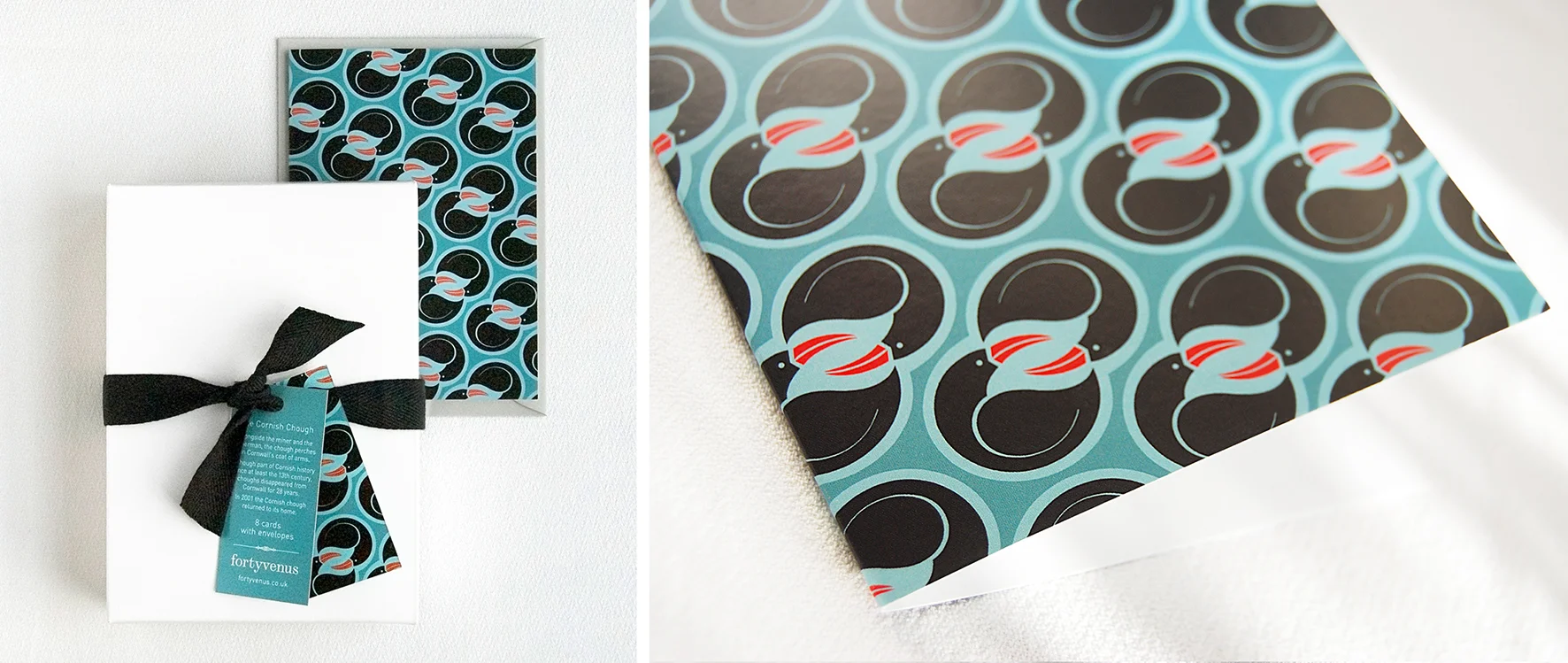
As with the previous two boxed-sets of cards, the Cornish chough and the lyrebird, I’ve placed an excerpt from a poem on the back of one of the tags. For this Scottish design the choice was obvious - Robert Burns and his 1789 song and poem ‘My heart’s in the Highlands’.

My heart’s in the Highlands, my heart is not here,
My heart’s in the Highlands, a-chasing the deer,
Chasing the wild-deer, and following the roe,
My heart’s in the Highlands, wherever I go.

Though my dad is not generally a card-giver, the pattern is for him and the Scottish side of my family. Oh and maybe Mads Mikkelsen too...

Creating a new pattern range

More than once my mum had requested some note cards if I saw some nice ones. Standing in a shop one day perusing the selection, I recalled what I did for a living and thought – why don't I design some? So began a side project to create both my mum and mother-in-law their own personal boxed-set of cards inspired by their places of birth.

fortyvenus_CornishChough_cards
fortyvenus_Lyrebirdcard

My mum was born in Penzance, Cornwall. For her card, I created a motif using the distinctive red beak and black body of the Cornish chough (its legs are also bright red). Cornwall's coat of arms has the chough proudly perching between the miner and the fisherman. Although part of Cornish history since at least the 13th century, choughs disappeared from Cornwall for twenty eight years. Luckily for Cornwall and its national emblem, the chough returned home in 2001 and has been successfully breeding again since 2002. The design represents the returning pair of choughs and the repeat pattern is a nod to the crimping on a true Cornish pasty.

My mother-in-law was born, and lives, in Melbourne, Australia. This pattern uses one of Australia's best-known native birds, the ‘superb lyrebird’. Shy and rarely seen, the lyrebird has the extraordinary ability to mimic almost any sound ranging from chainsaws, car engines, camera shutters and fire alarms, to plagiarising the individual songs of other birds. The pattern is inspired by the male bird's beautiful tail feathers which unlike the upright fan of the peacock's – are fanned out and draped over its head during the elaborate courtship display. The pattern also features the delicate white flannel flower; a favourite of my mother-in-law’s. The yellow orbs are a symbol of the wattle; a flower so bright and sunshine yellow against the black aftermath of a bushfire.

I enjoyed this project so much I’ve decided to continue with additional patterns. Possibly next, tapping into my family’s Scottish heritage or perhaps turning to my own place of birth, Devon.

Further reading/viewing:
Cornish choughs - http://www.cornishchoughs.org
Cornish pasties (which never, ever, contain carrot) - http://www.cornishpastyassociation.co.uk/what-is-a-genuine-cornish-pasty/
The superb lyrebird and Sir David Attenborough on youtube.

Woman at work: Margaret Calvert & the road sign

On the hottest July day on record, Shoreditch Town Hall's seats are filled with perspiring designers – both the new and the more experienced – gathered for a D&AD lecture to be given by the typographer and graphic designer Margaret Calvert.

Margaret Calvert's name may not be well-known outside of design circles where she is deemed an icon but her work is viewed every single day by a large proportion of the population in Britain; communication design at its finest. Margaret Calvert (born 1936) studied at the Chelsea College of Art. It was here, that Calvert's tutor, Jock Kinneir (1917-94), asked her to assist him with designing the signs for the then new Gatwick airport. In 1957, Kinneir was appointed head of signs for Britain's roads. Kinneir hired Calvert and together they created the revolutionary system of road signage still in usage today and considerably copied around the world. One of their more controversial decisions was to opt for a combination of upper and lowercase letters rather than the capitals used on Britain's roads since 1933. After analysing existing typefaces and concluding that there "wasn't one easily understood at speed", they created a new typeface named Transport (New Transport, a new digital version, is now used by gov.uk). Pictograms were devised; 'Farm animals' is based on a cow named Patience whom Calvert knew; the deer and horse are based on Eadweard Muybridge's photographs of animals at speed. Calvert was eager to make the 'school children' sign more accessible with less grammar school overtones as comprehensives were starting up. "...wouldn't it be nice to turn it round..." Calvert said. The boy in a school cap leading a little girl, was replaced with a girl – modelled on a photograph of Calvert as a child – leading a younger boy.  

Wisbech

Listening to Margaret Calvert is a joy. She is honest – occasionally stating, "I'm a bit embarrassed to show you this" – and dryly witty. Calvert's wide-spanning career has included four years as head of Graphic Design at The Royal College of Art where the font she designed, Calvert, was the RCA's house font from the 1990's. Legendary designer Neville Brody, together with Calvert and Henrik Kubel, have since 'remixed' this font into Culvert Brody and this is now used throughout the college. Calvert spoke briefly about one of her own [design] 'heroes' – Thomas Heatherwick, the designer of the New Routemaster bus. "...I love his modesty, he's so humble about his work - and my favourite seat on the Routmaster bus is the front of the top deck" – and what better place for Calvert to survey her own work from. To this day, Calvert continues to "work and play", she has even deconstructed her own road signs and lately created a range of geometric rainbow postcards because she says "I couldn't find any I liked". Possibly closer to the truth is that Calvert admits she's not very good at holidays, "...I have to have something I'm doing". More recently, Calvert has been creating letters with pasta, and how do you make curves with pasta? - "You cook it!".

Now in the midst of the holiday season, Britain's roads are at their busiest. On the plus side though, 'Queues likely', gives us ample time to fully appreciate the work of Calvert, Kinneir and their team's longstanding work. So if you've recently travelled by road or motorway and haven't solely relied on Sat Nav, if you are on the daily commute or school run, or if you're about to negotiate your way through Gatwick Airport to a waiting plane, Margaret Calvert has almost certainly helped you reach your destination.

end sign

Here's one I made earlier...

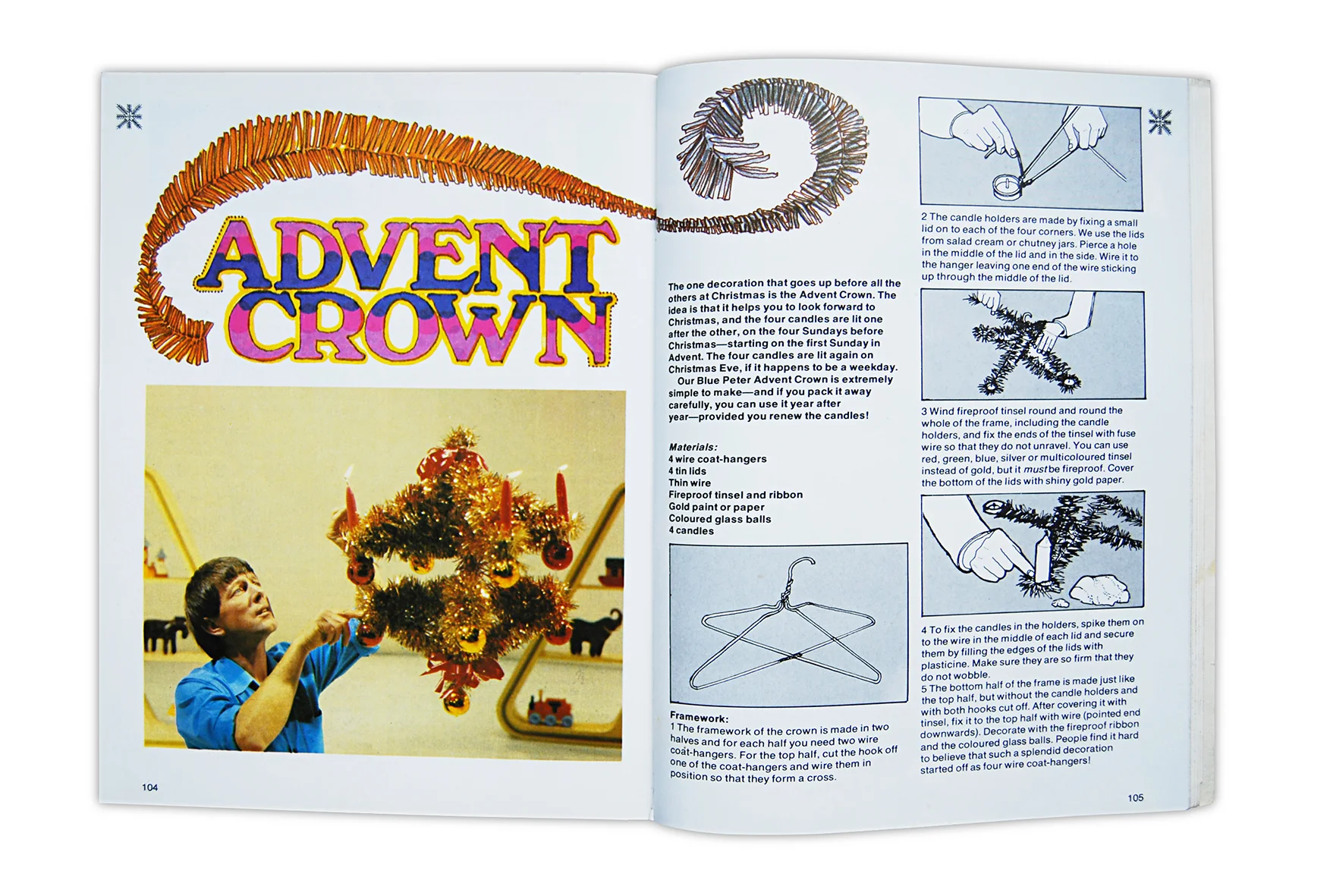
Way back before Pinterest was even a twinkle of glitter in its maker's eye, we had The Blue Peter Make, Cook & Look Book. In this classic 1978 cornucopia of cardboard and plastic bottle creations, the pinnacle of do-it-yourself Christmas; the Blue Peter advent crown. With a difficulty rating of ten and probably the most cursed at Blue Peter item ever constructed, John Noakes is shown gingerly lighting the fourth candle on this most iconic of festive fire-hazards.

So let's go retro, unbuckle our seat belts, introduce the cheese to the pineapple, dig out the wire coat hangers and tinsel, and in all probability, burn the house down. We've missed the four advent Sundays but it's not too late to have it ready for Christmas Eve when we attempt to light all four candles before the whole thing flops in on itself and drops to the floor. And when you're done, why not construct a bedsitter for Sindy? I know I did, back in the day, and no doubt worth millions now.

MakeCook&LookBook
adventcrown
tinselbirds
BluePeterbedsitter
BluePeterBedsitter

Pumpkins & the 'Polka Dot Princess'

Yayoi Kusama's perfectly plump, bronze pumpkins – small, medium and large – currently sit in the Autumn sun of the Victoria Miro garden. The legendary Japanese artist has drawn pumpkins since childhood back when her mother – hating to see her paint, preferring instead, to see her marry a wealthy man – would throw her work away. Kusama describes the pumpkin as a form of self-portraiture, a motif that features throughout her many decades of work. Named the 'polka dot princess' by the press, Kusama has said, "My art originates from hallucinations only I can see" – Kusama has suffered from hallucinatory visions since the age of ten. Now at 85 years old, Yayoi Kusama is as prolific as ever, and shows no signs of slowing down.

pumpkins.jpg

In 2012, Kusama illustrated Lewis Carroll's Alice's adventures in Wonderland – an ideal surrealist pairing for a day-dreaming girl's escapades down a rabbit hole. Kusama sees herself as 'the modern Alice in Wonderland', alternatively, she could just as well be the caterpillar perched on a mushroom puffing on a hookah, creating smokey spots, and remarking "one side will make you grow taller and the other side will make you grow shorter". Pumpkins, in all manner of shapes and sizes, feature prominently throughout Kusama's depictions of Alice and her exploits.

The glorious pumpkin; a maker of fine soups, a term of endearment, October's ubiquitous Jack O' Lantern, a fairytale shape-shifting mode of transport on loan until 12am on the dot (pun intended), and now, stunningly immortalised in bronze and emblazoned with polka dots. A most prolific and versatile fruit indeed.

Kusama Alice cover
kusama2
Kusama3

The Cornershop

Pop to your local shop in Wellington Row, Bethnal Green, London, and you're in for a treat – but not so much as a Hobnob is edible. Artist Lucy Sparrow has filled a former derelict store with over 4,000 handmade felt grocery products. It took seven months to stitch everyday items from fruit, baked beans and loo roll, to newspapers, ice lollies and oven chips. Even the till and functioning pricing gun are fabric. 

My love (and experience) of packaging design instantly attracted me to Lucy Sparrow's stitched shop. Never before have I travelled by bus to a corner shop; this act in itself seems poignant, as one aim of the artwork is 'to tackle some of the realities of contemporary living'.  For many communities, the disappearance of local shops and replacement with further-to-reach large chains is a depressing reality. Opposite to the often soulless giants, this space leaves a warm feeling, conducive to friendly chat. Perhaps it's the felt; the iconic material of many a childhood (I still have my 'Noddy in fuzzy-felt Toyland'). The brands are contemporary but there is an overwhelming experience of nostalgia. Cheerful solid colour shapes with logos stripped of their photoshop embellishments; the result is quite beautiful. The stack of newspapers, of which The Daily Mirror's particularly memorable cover page – 'I've eaten my girlfriend', and the shelves displaying rows of cigarettes (how long before these become plain packaging?) all add to an immensely detailed and rewarding project. 

To Lucy, I enquired – what next? It would seem the land of Hershey's and the Twinkie may be receiving the fluffy felt shopping experience...   

The Cornershop is at 19 Wellington Road, London E2 7BB
Open 10am - 7pm   1st–31st August 2014

Every felt product is available to buy – from Marmite and SPAM, to the till itself. http://www.thecornershoponline.com

The 'responsive W'

In May 2013, The Whitney Museum of American Art, New York, gained a new graphic identity; and what a mighty clever one it is. Created, in collaboration with the Whitneyby Amsterdam-based design team Experimental Jetset and named the 'responsive W', this acrobatic letter-form is fit, flexible and lithe; bending, springing, squishing, stretching, zig-zagging hither and zither. For me, it was love at first sight.

whitney logo.jpg
Whitney_2013Redesign_Buttons
Photos by Jens Mortensen

Photos by Jens Mortensen

Initial viewing of the Whitney logo in application prompts a need to exclaim, 'it's alive!'. This ingenious W is one that 'responds to the art' featured beside it, adapting to the space graciously whilst maintaining its strong brand identity. It goes far beyond a logo sized accordingly next to a photograph. This identity is no showboater; its monochrome form does not detract from the O'Keefe or Hopper it nestles up to.

The 'responsive W' can be seen in glorious action here, and Experimental Jetset's thought processes behind the identity, are here.

So taken with the Whitney's new logo, I was inspired to create movement in my own graphic identity. The fortyvenus 'planet' is a changeable device; able to bounce and spin on the lines, or strings, that hold it. Like a Newton's Cradle with its swinging spheres or the continuous moving string in the Cat's Cradle game, the lines change direction, adapting to fit in the surrounding space, and in doing so, randomly alter the segments of colour (influenced by the hues of London and Australia). 

fortyvenus_images

Meanwhile, in downtown Manhattan, the Whitney is constructing a new building designed by architect Renzo Piano and due to open to the public in Spring 2015. The Whitney's energetic experimental W, will be given an exciting and expansive new space in which to stretch.

This blog was brought to you by the letter W and the number 40

Confessions of a magazine junkie

It has been four months since my last magazine (Little White Lies Issue 50).

A recent loft expedition to store away (dump out of sight) some object or other, led me to forage a little into taped-up boxes. Sadly no unveiling of an ageing portrait, but instead, amongst the old toys and paint pots, box upon box of publications from the late 70's onwards. Undeniable evidence of a magazine junkie. 

Look-in, my first printed love. Nine pence handed over every Thursday – rising to fifteen pence around 1980 – to pore over 'top picture strips' Benny Hill, Sapphire & Steele and Battlestar Galactica. The joy when Blondie graced the cover in 1979. If Look-in dominated the primary school years, then Just Seventeen, launched in 1983, defined my early teens. But we the readers, were not 'just seventeen', we were a barely-aged-thirteen gaggle of school-girls huddling round each new issue to read the explicit advice page and learn a thing or two about growing up. In 1988 came SKY magazine. Oh how I adored SKY in its early years. On order from the local corner shop, SKY opened up the world to me in my seaside home town. Frequently fronted by Madonna, its favourite cover star, and aimed squarely at both sexes – a major plus point in my eyes – it told tales of emerging street drugs and gang culture.   

lookin_J17_SKY

Art college arrived and with it came the style behemoths: i-D, The Face and Blitz. Of the three, only i-D – giving us the wink since 1980 – resides on shelves today. Blitz ran from 1980 to 1991 and The Face from 1980 to 2004. The graphic designer's 'God' of the eighties, Neville Brody, designed The Face from 1981 to 1986. Brody's groundbreaking work, much of it influenced by his interest in Dadaism, Futurism and Constructivism, revolutionised the look of magazines and design in general. Sad days indeed when these two eighties 'style bibles' folded. Together with a magazine-loving college cohort, we lessened our food bills and increased our monthly magazine intake. Titles were actively sought, import prices paid, and the American pages of Raygun and Interview were perused. David Carson, acclaimed graphic designer known as the 'Godfather of grunge', art-directed Raygun in its early years from 1992, showcasing his experimental, not always legible, typographic techniques. Raygun folded in 2000, a few years after the probable end of the grunge era itself (see - The Rise and Fall of Grunge Typography by Sharan Shetty). Originally founded by Andy Warhol in 1969 and still going strong, Interview championed its 'stars talking with stars' format (admittedly I soaked up the typography and style more than the conversations).       

TheFaceIDBlitz

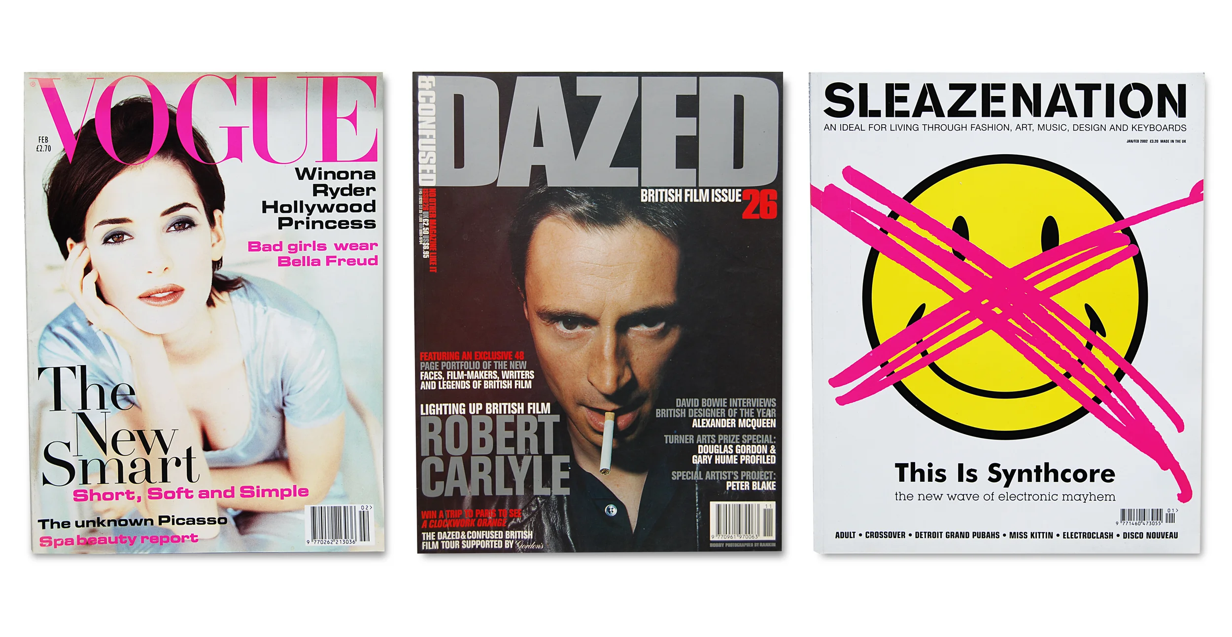
Dazed & Confused, (recently relaunched as Dazed) founded by Jefferson Hack and photographer Rankin in 1992 became my new paper best friend for the nineties, journeying with me into the new millennium. Initially given free to clubbers, Sleazenation launched as a high street magazine in 1996, and in the same year, Wallpaper* opened its Scandinavian drawers and gave us its 'global authority on design'. Launched by Tyler Brulé and Alexander Geringer, Wallpaper*'s tagline read: *The stuff that surrounds you. Well, I could but dream. My monthly film fix came courtesy of Sight&Sound and later joined by the bold, and beautifully striking, bi-monthly Little White Lies. There were others of course, piles of film magazine Empire, interior design Cosmopolitan Home, entertainment and arts 20/20, Creative Review, Design Week, Eye, NME and the odd international title in German – I just gazed at the photography.

VogueDazedSleazenation

With pregnancy came a magazine identity crisis. Which section did I now belong in?  Not ready for the pastel soft-focus hues of the parenting shelf, and distanced from Wallpaper*'s un-child-friendly interiors and the late-night style culture of Dazed & Confused, resulted in a publication limbo. For some years my magazine habit was abated by Thomas the Tank Engine. Then a relapse. Whilst living in Australia, I had found a new bi-monthly to treasure, Frankie – for all things handmade, vintage, and for those with a doily obsession. 

I admit, a paper cull is needed, or a bigger house; I fear this one will collapse under the colossal amount of 90gsm. But for the moment, this unearthing of my 'precious things' has been a rainy day memory trip through past decades, the recalling of a life lived through magazines. A huge beautifully styled photo album of people I've grown up with but never met. Many artists are no longer with us, some grew to immense popularity and others vanished. Styles have been, gone and returned again. Typography has looked clean, become dirty, and today, is lovingly hand-drawn. I confess, my magazine addiction was far greater than I had thought. So I ask, for the sake of house space; do not lead me back into temptation, let me pass WHSmith without succumbing to the gravitational pull of a well-designed cover (I'm hearing the sirens' call of Little White Lies) and finally, let us not bring back the day-glo, again.

Sight&SoundLWLfrankie

Snip! Snap! Snip! The scissors go...

Today is World Book Day and I've dusted off a certain book that both enthralled and terrified me as a child. Struwwelpeter (Shock-headed Peter) by Dr. Heinrich Hoffmann was first published in 1845 and must have turned a fair few generations off thumb-sucking.

Alongside Conrad and his missing digits, who could forget the dreadful story of Harriet who when left alone, lights a match – 'they crackle so' – and is burnt to a crisp, leaving only her scarlet shoes and crying cats. Fidgety Philip refuses to sit still at the dinner table and ends up with the entire table contents on top of him. Johnny Head-in-air is determined not to look where he is walking; preferring to face the sky, he strides headlong into a river. Johnny is hooked out and lives, teased for his stupidity by the fish. Others are not so lucky. Augustus, who would not have any soup, is a 'chubby lad', he stops eating and on the fifth day... he is dead.

Who can say whether I was a better behaved child as a result of this book. Whether Hoffmann's gloriously gruesome tales kept me sitting still at the dinner table, eating soup, and far away from matches, is unknown. But one thing is for sure. I never, ever, sucked my thumb... 

struwwelpeterCOVER.jpg
scissor man2.jpg
harriet.jpg